<!DOCTYPE html>
<html lang="en">

<head>
    <meta charset="UTF-8">
    <meta http-equiv="X-UA-Compatible" content="IE=edge">
    <meta name="viewport" content="width=device-width, initial-scale=1.0">
    <title>Document</title>

    <style>
        * {
            list-style: none;
            padding: 0;
            margin: 0;
        }

        #header {
            text-align: center;
            background-color: black;
            color: white
        }

        .nav ul {
            line-height: 150px;
            height: 150px;
            width: 150px;
            display: inline;
        }

        .nav li {
            display: inline;
        }

        .nav li a {
            color: white;
            display: inline-block;
            height: 100px;
            width: 100px;
            line-height: 100px;
            text-decoration: none;/* 밑줄제거 */
            font-size:20px;
            font-weight: 500;
        }

        .nav li a:hover {
            border-radius: 50px;
            background-color: #777;
            font-size: 200%;
            color: aqua;
            transform: scale(1.64);
            transition-duration: 0.8s;
        }


    </style>
</head>

<body>
<!--
    <ul class="nav">
        <li><a href="#">목록</a></li>
        <li><a href="#">목록</a></li>
        <li><a href="#">목록</a></li>
        <li><a href="#">목록</a></li>
    </ul>
-->

    <header id="header">
        <h3>목록만들기</h3>
        <nav class="nav">
            <ul>
                <li><a href="#">메뉴</a></li>
                <li><a href="#">메뉴</a></li>
                <li><a href="#">메뉴</a></li>
                <li><a href="#">메뉴</a></li>
                <li><a href="#">메뉴</a></li>
            </ul>
        </nav>
    </header>

</body>

</html>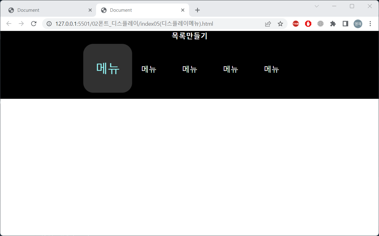
border-radius가 50px이기 때문에 메뉴에 커서를 두면 네모에서 원으로 바뀐다
transform, transition을 통해 에니메이션효과 부여.
'HTML·CSS' 카테고리의 다른 글
| 221221 HTML CSS border 추가 (0) | 2022.12.21 |
|---|---|
| 221220 HTML CSS 백그라운드 (0) | 2022.12.20 |
| 221220 HTML CSS display (0) | 2022.12.20 |
| 221220 HTML CSS 텍스트와 BORDER (0) | 2022.12.20 |
| 221220 HTML CSS 폰트 (0) | 2022.12.20 |


