221227 Html CSS FLEX
FLEX문법 기초
flex의 단점
->아직도 디자인을 Internet Exproler에 맞추는 문제가 있다
신규문법 사용 불가
flex 교안 출처: https://heropy.blog/2018/11/24/css-flexible-box/
flex문법
부모박스, 자식박스
부모박스:container박스
☆display
☆flex-flow
flex-direction
flex-wrap
☆justify-content
☆align-content
☆align-items
자식박스:item박스
order
flex
☆flex-grow
☆flex-shrink
☆flex-basis
align-self
레이아웃을 구성할 때 float, position을 사용하지만, flex문법을 통해서도 할 수 있다.
flex레이아웃은 부모박스에 flex를 선언하고, 안에 있는 박스 요소를 유연하게 배치하는 속성임
display: Flex Container를 정의. 무조건 들어감
flex-direction: main-axis라는 주축, cross-axis라는 교차축의 개념을 알아야.
주축-아이템이 정렬되는 방향
교차축-아이템 정렬 방향의 반대(주축이 가로면 세로)
flex-direction은 주축을 결정함
justify-content는 주축 설정에 따른 정렬 방법 설정
align-content와 align-items는 교차축
align-content는 여러줄
align-items는 한줄
flex-wrap은 flex items의 여러 줄 묶음(줄 바꿈) 설정
display
flex : 블럭 특성으로 부모박스 생성
inline-flex : 인라인 특성으로 부모박스 생성
flex-direction
메인축 방향 설정
row : 가로
row-revers : items를 row의 반대 축으로 표시
column : 세로
column-revers : items를 column의 반대 축으로 표시
flex-wrap
item의 줄바꿈 표현
너비에 아이템이 가득 차 있을 때 한줄로 나타낼꺼냐, 자동으로 줄바꿈해서 나타낼꺼냐.
nowrap-기본값(한 줄에 표시. 길면 부모 범위에서 나감)
wrap-items를 여러 줄로 묶음(줄바꿈)
wrap-reverse(역방향. 굳이 쓸 일 없다)
flex-direction,flex-wrap을 따로따로 해도 되고,
flex-flow로 한번에 하는 것도 가능
flex-flow : direction속성 wrap속성;
<!DOCTYPE html>
<html lang="en">
<head>
<meta charset="UTF-8">
<meta http-equiv="X-UA-Compatible" content="IE=edge">
<meta name="viewport" content="width=device-width, initial-scale=1.0">
<title>Document</title>
<style>
.box{
background-color: aqua; padding:10px;
}
.box .item{
background-color: teal;
width:50px;
height: 50px;
}
.container{
/* flex의 기본 item의 너비 만큼 가로배치 */
/* flex-블럭배치, inline-flex-인라인배치 */
display:flex;
/* 주축 설정 row 기본값 */
/* 세로-column */
flex-direction: row;
}
</style>
</head>
<body>
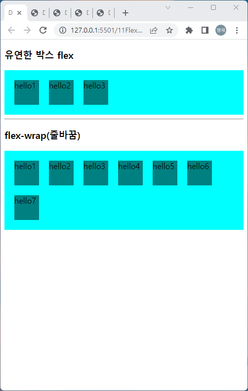
<h3>유연한 박스 flex</h3>
<div class="container box">
<div class="item">hello1</div>
<div class="item">hello2</div>
<div class="item">hello3</div>
</div>
<!-- <div class="container box">
<div class="item">hello4</div>
<div class="item">hello5</div>
<div class="item">hello6</div>
</div> -->
<hr>
<style>
.box{
background-color: aqua;
padding:10px;
}
.box .item{
background-color: teal;
width:50px;
height: 50px;
margin:10px;
}
.container2{
display: flex;
/* flex-flow는 direction과 wrap을 같이 작성하는 속성 */
flex-flow: row wrap;
/* flex-direction: row; */
/* 더이상 공간이 없을 때 줄바꿈처리, 기본값 nowrap*/
/* flex-wrap: wrap; */
}
.container2 .box{
width:200px;
}
</style>
<h3>flex-wrap(줄바꿈)</h3>
<div class="container2 box">
<div class="item">hello1</div>
<div class="item">hello2</div>
<div class="item">hello3</div>
<div class="item">hello4</div>
<div class="item">hello5</div>
<div class="item">hello6</div>
<div class="item">hello7</div>
</div>
</body>
</html>